A few of you have asked to see a bit more of our whole house remodel so I thought I would share some pictures of our new living and dining room combination.
When we bought the house nearly 3 years ago, these two rooms were separate. They were perfectly serviceable as they were, but they simply didn't work for how we live. We like a more open floor plan and the walls which separated the living and dining rooms made them feel dark and isolated from one another.
Before we remodeled, when you walked in the front door you were immediately greeted by a large wall. This awkward arrangement forced guests to funnel left to a hallway, or right into the living room. It wasn't the best concept when you had a large number of people over, simply because it created a big bottleneck.
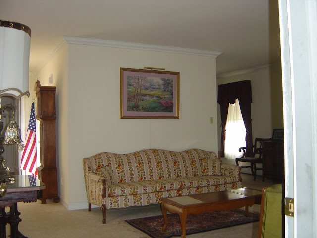
Above is how the living room and entry looked just before we went to settlement, and before the previous owners had completely moved out. You can barely see the front door on the left and how the entryway led right into a wall.
An even earlier picture taken the second time we came to look at the house shows the wall that divided the living room and dining room. The wall behind the sofa made the dining room, located behind it, feel like a tiny box.
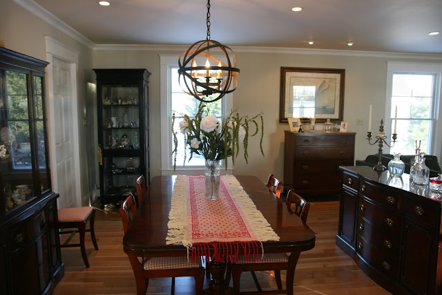
This "before" picture of the dining room shows how closed off and cramped it really was. The previous owner's dining table stuck out into the walkway that led from the dining room into the kitchen. We actually used this space as our office when we first moved in.
Before we even started the remodel, I convinced Mr. Tide to let me take a hammer to the drywall on these two walls to see if I really wanted to take them both down. I already knew the answer would be a resounding YES, but it made it seem like I was trying to be methodical and logical...something he likes!
Once the walls were gone it was like a new house, so much brighter! Above, the front door is to the left and you can see the wall just inside the entry is gone. We took out part of the wall on either side of the doorway that leads into the hallway to install a pocket door and a new opening to the kitchen. What a difference taking things "out" can make!
If anyone tells you that remodeling is fun, fast, or not messy...they are lying!!! We lived in utter chaos for a long time and our house often resembled a very bad version of an antiques store!
On the far end of the living room was a gas stove that the previous owners had overheated at some point and the glass was all cloudy. Mr. Tide had a few choice words while removing both it and the floor tiles by the door that leads to the garage.
I have to say that it was worth every dusty, noisy minute though, because instead of having two rooms that didn't function well at all, we ended up with this!
Instead of two dark under-utilized spaces we now have a large open space, perfect for entertaining. Where the gas stove once was, is now a large entertainment center to hide Mr. Tide's 52 inch TV.
Instead of this...
We now have this...
Where "once" we had this...
This is what we now have...
We had originally thought that we would use columns to provide a little definition between the living and dining rooms, but once the room was wide open we realized the columns blocked the view to the water, so we now have several columns neatly tucked away in the garage...anyone need some columns?!
The mock-ups for the columns made it pretty clear that they had to go!
Now we have views out to the water from nearly every seat.
I love the interior views almost as much as the ones out to the creek, like this one from the kitchen into the new living and dining room.
And this one from the dining room into the new kitchen.
Now, instead of guests being greeted by a wall, they are welcomed into a bright open space.
The mahogany Duncan Phyfe dining room suite once belong to my grandparents. It's been with us in 3 previous homes, and although it's more formal than I would have chosen for myself, the sentimental value makes it perfect!
One of my favorite things in the whole room is this chandelier, which our son has named "the atom"! I already had a nice Hubbardton Forge chandelier, but when I saw this one I knew it was a must have! Thanks to my friend Shari, who is also a decorator (more about her in an upcoming post) I also got it for a great price! Thanks Shari!
The living room and dining room are filled with treasured items that we've purchased or inherited. These silver (they need a nice cleaning but salt water and silver do NOT mix! and I have to admit I kind of like this look) candelabras were a wedding gift to my Great Aunt Frances back in the 1920's.
I love having the TV tucked away behind closed doors, especially since this is the first room you see when you enter the house. We had a formal living room in our last house and never used it, so we decided to put the TV in here so that we would use the space more often.
My Great Aunt Margaret and Uncle George's dropleaf table fits perfectly in the spot to the left of the front door. The gilded mirror was a bargain find at Lowe's. Someone special ordered it and then didn't like it so it was on clearance for $65.00!
The new pocket door keeps the noise contained if someone wants to watch a loud action movie, and it keeps the dogs corralled when our son has friends over.
Because our ceilings are only 8 feet tall, the new entryway light needed to be a flush mount design. I liked this one, which was inexpensive and came from Lowes, because it reminded me of a seashell.
Mr. Tide and I met racing sailboats a little over 24 years ago, so it seemed appropriate to have some sort of sailing themed artwork in the room. This print was another inexpensive find from a favorite local store The Apple Basket.
This glass sided cabinet houses all of the little "pretties" that I don't want to get broken by puppy dog tails! I stumbled upon it at Traditions of Loveville and bought it before the remodel...only "I" would buy furniture when I knew it was only going to add to the jumbled mess of a renovation! I'm glad I did though, I love the black and how it has glass on all 4 sides!
This cream ginger jar lamp, another inherited piece from my Great Aunt Frances, sits atop a tiger maple tavern table built by my mother and father. I love the detail on this lamp and remember it sitting on a table in my Aunt's living room.
This hepplewhite chest has been in my mother's family for generations. It came to her from her Aunt Ann and I inherited it from my mother. My mom used to store wrapping paper and greeting cards in the upper drawers and table linens in the lower drawers. I also use it for table linen storage.
Another family heirloom is the Waterford lamp left to us by my mother and father. It sits on the drop leaf table illuminating the many family photos we have placed there, including a favorite picture of my in-laws.
So there you have it! A tour of our living/dining room remodel. I still have grand plans for this room. I'd like to slipcover the furniture in white duck cloth, get a lovely piece of driftwood and maybe a few ironstone pitchers to go on top of the TV armoire. I also hope to pass the dining room furniture down to one of my own children and replace it with a round table and built-in china cabinet with an open hutch similar to the one in the movie "Something's Gotta Give," but for now I'm happy and pleased with how well the new space turned out. I hope you enjoyed the tour!
and
I'm linking up for Metamorphosis Monday over at Between Naps on the Porch. To see more great transformations head on over to Susan's wonderful blog!
















.jpg)


That dining room chandelier is definitely a show-stopper! Love it!
ReplyDeleteoooohhh, LOVE it! Good eye to see the potential.
ReplyDeleteSuzanne
What a great transformation! Just wanted to let you know that I've made some changes for my white wednesday. I made a new button and chaged the name to Wednesday Whites, so it's not confused with someone else's white wednesay
ReplyDeleteHugs, Rhondi
It's lovely - such a good decision to open up the space. Our living/dining rooms are also filled with family treasures which I love. It does make it hard to part with them and get something new though.
ReplyDeleteYou did an awesome job on the makeover...love your buffet and china cabinet...I should...you see I have the same ones...mine came from Mr.Coastal Charm's parents...he wanted the dining room furniture because his mother was a very formal lady and she loved to entertain.
ReplyDeleteBlessings,
Linda
I love your dining room chandelier and so many other things in your home. I've got to come back and look again when I'm not so tired...I love looking and you have a gorgeous place. Love how you can take advantage of outside views too, that always makes it special. -Lili
ReplyDeleteThis is beautiful. I love the open look. The first thing that caught my eye was the chandelier, love it! You did a wonderful job with this remodel. I'm sure that all the mess and inconvenience were well worth it. Kathy
ReplyDeleteWhat an amazing transformation! I adore the wall color and the fact that you incorporated so many woderful heirlooms into the rooms design.
ReplyDeleteThat is awesome! Great job, and I think it was a good call to leave the columns out.
ReplyDeleteWhat a stunning room. The transformation is incredible. I admire the ability to see what can be done with a remodel. Everything is just gorgeous. Your family heirlooms are wonderful. Hugs, Marty
ReplyDeleteThanks everyone! It was a labor of love and we really use these two rooms so much more now!
ReplyDeleteKat :)
What a brilliant idea to knock down those walls! What a huge difference it makes. I love the openness of the space and all the windows. The rooms look very lovely. I really like your dining room set and all your lovely pieces. Your ideas of slip covering the furniture and putting a round DR table and built-in cabinets sounds like a good one. It will give the rooms yet another great look!
ReplyDeleteThanks for sharing.
I love your TV cabinet! My husband also had to have a large TV, ironically enough, also 52 inches, and wanted it above the fireplace!!! Can you imagine putting a 52 inch TV above the fireplace???? I said NO WAY and came up with another alternative - remind me to show you a photo :) Our living room is a very awkward space due to having FOUR doorways, and since we wanted to change the location of the sofa, that meant that the only spot for the TV was in front of the large double windows - I didn't really like the idea of blocking the entire window any more than having the TV above the fireplace, so we compromised - haha!
ReplyDeleteBut anyway, I digressed - you have a beautiful open space now, and think that it was worth the chaos, dust and hassle of remodeling :) Mine, on the other hand, I'm still not so sure about!
Your remodle is absoultely spectacular. What an amazing metamorphosis. I thoroughly enjoyed your post.
ReplyDeleteCarolyn/A Southerners Notebook
I love your transformation. May I ask: what are the lovely paint colors? The celing and walls look great!
ReplyDeleteHi Ann thanks for the nice compliment and the paint on the walls is Maison Blanche by Pratt and Lambert. The ceiling is Oyster White, an old Duron color that they can still mix for you.
ReplyDeleteKat :)
Oh my goodness!!! What a difference! Your home is absolutely beautiful. I love the light fixture above the table - AMAZING. It really catches your eye. Great job on the whole project :)
ReplyDeleteThis is GORGEOUS !! I'm amazed at the transformation your home has gone through. You must be thrilled and enjoying your gorgeous, new spaces so much !! Thanks for the tour ... look forward to visiting more often. Take care, Becca (Adventures in Decorating)
ReplyDeleteFantastic job! I am wanting to do something similar, but more complicated to make a huge kitchen.
ReplyDeleteBeckie in Brentwood, TN
Really beautiful! I know how awfully messy and at times depressing remodeling can be - well done for getting through it. Of all your lovely things, I adore the dining chandelier the most.
ReplyDeleteYour home is beautiful. I know you are enjoying the openess much better. That chandelier is quite unique. I have never seen one like that.
ReplyDeleteWhat a beautiful remodel. The open space is so inviting. I also love the paint colors you chose. Everything looks just gorgeous!
ReplyDeleteTammy in VA
Your home is incredibly beautiful. I love what you did with the makeover. I'm dying to rip out walls but we just aren't skilled enough for that!
ReplyDeleteWhat a beautiful job!! I grew up on an island with water views~ I miss that, for sure! But now I look out my windows at the majestic Wasatch Front mountains in Salt Lake City- another view of God's beautiful creations! Thanks for the peek!
ReplyDeleteI love your new space! I'd love to see more of your kitchen - what color is that on the walls? I can't tell if it's gray, green or blue? But whatever it is, it sure looks good with the red accents!
ReplyDeleteYou mentioned that you wouldn't have chosen such a formal dining room suite. Have you considered painting it white? I have an almost identical set, also from my grandparents, that I'm thinking of painting. My husband says NO, but it's from my family, and it's what I really want. I think it would look good in black as well. I've actually seen some of the pieces painted in the white and they're gorgeous!
Just a little something to think about!
Leslie Anne
Oh, here I love that light over your table and your choice of hardwood!! Really pretty remodel. Couldn't get my hubby to do hardwood when we remodeled. Funny how similar our remodel colors and taste are. I even have butterflies on my wall.
ReplyDeleteThat is it, I am packing my bags now and ready to move in! I love it all I really love the chandelier, so you must post more informations about that FOR SURE! I love it all!
ReplyDelete(I do have to ask, do you miss the fireplace? We don't have one and I long to have one!...)
I need a whole house tour. By the way I was thinking of featuring some readers on Saturdays... would that interest you? Let me know!
Cassity
wowie! worth it all for sure :) I just love your atention to detail in the decorating!
ReplyDelete~ Emily N. from "too Blessed to Stress"
This is stunning. You could be a catalog house.
ReplyDeleteMy word, what a breathtaking space you have. Every piece is a work of art and the space has such comfort and heart. I just love it. Very inspiring.
ReplyDeleteWhat a great space! I love the chandelier! What a beautiful home. Thanks for sharing your wonderful photos.
ReplyDeleteStunning! WOW. I'm going to be here for a while...this will require a bit of studying!
ReplyDeleteLOOOVE what you have done with the house....:)
ReplyDeleteActually, I'm just a good friend......great site Sally
ReplyDeleteI was just bopping around your blog. What an awesome job! It's so open.
ReplyDelete- The Tablescaper
Hi, love,love,love your home! Any chance of a link for the light over your dining table?
ReplyDeleteThanks,dee
Hi Anon, thank you very much and the light is by a company called Solaria Lighting.
ReplyDeleteThe link below takes you directly to the page for my particular light and this store has them for a good price. Just copy and paste it into your browser or you can go to www.onebigstores.com.
http://onebigstores.com/webstore/store/listcategoriesandproductsingrid.asp?orderby=DESC&price1=0&price2=0&idsupplier=24&order=&mainkeyword=&IdCategory=2613&curpage=2
Kat :)
Truly an amazing labor of love and it shows!
ReplyDeleteThanks for sharing!
What a great job you did with your floor plan and changes. We live in a 1840's house, and it has big rooms, but so disconnected with oneanother. Just love your open floor plan, and what you have done with your decor. Thanks so much for sharing. blessings, carrell
ReplyDeleteI had to laugh at the old light above the dining room because it looks similar to the one where we are moving (I told my hubby it has to go!). I don't want a hanging one because I am always moving furniture around and it would limit where I could place the table, so I will probably go with a ceiling light. Love the way you opened the space!
ReplyDeleteThank you Nannykim, that light was definitely one of the first things we thought had to go too! I think a ceiling light makes perfect sense if you move your furniture frequently!
ReplyDeleteKat :)
Thank you so much for the wonderful pictures and sharing your stories on the treasures within.
ReplyDeleteI'm with you - it would be difficult to get rid of, or re-do a makeover on heirlooms. We are lucky that we have a cellar to store things that don't work so i can keep things for the kids "someday" when they can appreciate them!
ReplyDeleteOh my word!!! What an amazing redo!!! It's blogs like yours that make me believe that there is actually a "light at the end of the tunnel!" You see, we bought a fixer this past summer and it's still in total chaos...probably going to take awhile before we can affordably put it together both functionally and aesthetically!
ReplyDeleteAnd I really, really love the armoire that houses your large tv! May I ask where you purchased it? We've been looking for something similar, but it's never the right size or design. Thank you in advance!!!
Best,
Jessie
P.S. I just found your blog and quite enjoy it (I have been blogging for about 4 months), and I am your newest follower!!! :)