

We all know that accessories are an important part of design. Whether you are talking about fashion or homes, accessories are the icing on the cake when it comes to design.
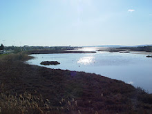
You also know how I like to drone on and on about drawing design and color inspiration from nature and there is a good reason for that. Nearly everywhere you turn in nature there are pops of color used to accessorize and accentuate the landscape to make it more visually appealing!

Colorful accents, even muted ones, are what draw the eye in and make us want to see more. It's the same way with our own homes. Take a close look at any home interior magazine and really study each photo. One of the tricks of the trade is to beautifully accessorize a room to achieve that perfect look that we all want to emulate! Stylists have a gift for this and will often times open closets and cupboards looking for beautiful, and often times colorful, accessories to use in a shot. It's also why stylists and designers often have the most beautiful homes!
If you think about it, pops of color are what make us love our homes more in the spring and summer, when everything is in bloom and our houses look perfectly accessorized and all dressed up in their Sunday finest! It's also why we tend to have a little bit of a let down when we remove all of our holiday decor each year. That added punch of color and "stuff" tends to make us feel like our homes are a little more pulled together and polished looking.

Even monochromatic design schemes introduce color. It's often a much more subtle color used to accessorize, but it is color none the less and helps to add visual interest to a space. If you've ever viewed photos taken by yourself and wondered why it doesn't look like something from a magazine, then do a little staging and bring in some color!
Even the most beautiful white on white room or black and white kitchen can benefit from a little colorful accessorizing. And you don't have to go out and purchase something to achieve the look...fill a beautiful pottery bowl with oranges, lemons or limes. Or go to a local market and gather up a bunch of flowers! Several stems of daisies spread out among small vases or wine bottles lining a windowsill make a bold statement and cost very little!

Take some advice from my friend the butterfly. Blue and black make a wonderful color combo, but what makes his or her outfit, are those dashes of red! Clearly this is one insect who knows how important the right colorful accessories can be!
What color is your favorite when it comes to accessorizing both your home and yourself?


So true. Butterflies know best...nothing goes better with a black dress than colorful shoes.
ReplyDeleteHow did you get that butterfly to stay so still??? :)
ReplyDeleteYou know all of a sudden, I've fallen head over heels in love with bright pops of color! In our home, in our yard, with my clothing. Today I'm wearing a black pinstripe sleeveless A-line dress with black heels, but what really makes it all work is my big turquoise blue bracelet I picked up from Kohls. Love color!
ReplyDeleteMary Ellen
Hi Kat, I agree, a room needs a hit of color. I am a neutral girl on the most part, but I have been using a hit of pink lately. Pale bellet pink in my bedroom and more of a rhubarb color outdoors and in other rooms. I needed a pick-me-up color and this works well. I can also change it very inexepensively if I feel like it.
ReplyDeleteLovely pictures and words, Kat! Wishing you a wonderful Wednesday. xx
ReplyDeleteGreat post Kat. You know I am a color loving girl. I like neutrals, too but I feel better surrounded by color. My favorites are greens and reds in the house, but I actually where more whites and blues.
ReplyDeleteA sweet hello from Frog Hollow Farm. I love including color in my home and in my clothing. The right colors wake up my eyes and also wake up a room and seem put everything in the room in the right perspective. Ciao, bella.
ReplyDeleteYou know COLOR is very important. You remind us that nature is the best inspiration for color combinations.
ReplyDeleteI tend to stay with nuetrals.. browns, light blue hues, soft greens, but for some reason as we are decorating and planning for This Old House, RED is flirting everywhere. I've done very little with red in the past, and for some reason this house is asking for red. So I am picking things up in "neutral" reds, sometimes in subtle ways... let's see how it goes..
ReplyDeleteI love this post..its so well written and so true :-) I love warm,earthy and rustic tones for my home. However I have a weakness for white/cream as well!
ReplyDeleteWhat a beautiful post and photos! My favorite colors to wear and to decorate our mostly white, creams, pinks and soft yellows.
ReplyDeletehugs
Sissie
I like pops of red and yellow for the kitchen...
ReplyDeleteThe bedrooms I preferred in more muted tones.
Di
Great advice, my friend! You know how I love red. But I find in this horrid Texas heat I'm bringing in more blue. And toning down the red a bit. Hard to believe, huh?
ReplyDeleteBrenda
I'm with the butterfly on this one - blue is my favourite colour to use around the house.
ReplyDeleteI love turquoise.
ReplyDeleteAnd red.
Not together though.
Beautiful butterfly photos, Kat!
Gorgeous photos, Kat! Green, red, and black are the accent colors I tend to always turn to...
ReplyDeleteThe rooms in our house all contain neutral tones of yellow and blue and green, in some combination. Each of them also have a pop of red ... a sofa, oriental rug, pillows, or whatever. Things are turning, though, as the tones of my favorite colors evolve. My reds are shifting toward burgundy, the blues are becoming turquoise, and the yellows are now almost gold.
ReplyDeleteI did a butterfly shoot last summer with a dead butterfly I found. It was easy to get just the shot I wanted. :)
Connie
Well, I do LOVE lilac and sage green! However, I do love whatever color happens to make me smile...fickle enough ? I think so. I just happen to LOVE color.
ReplyDeleteI also happen to love your pictures of those beautiful butterflies.
Thank you for sharing them with us!
Suzy
I couldn't agree more! I just learned about color spotting recently from Kathysue's blog and am now consciously thinking about what those "spots" should be! Also, what colors they should be. Wonderful way that you incorporated these beautiful images with this GREAT design lesson.
ReplyDeleteThanks, Kat! xx Suzanne
It would be so much fun to hang out with a stylist to learn a few tricks of the trade and that's why it was fun to read the reminder about paying attention to nature's palette! ~Lili
ReplyDeleteBeautiful butterfly photography.....
ReplyDelete